I would like to explain one thing, which is why the apparent death rate for cases of covid19 looks like it is declining. In part this is because I get sent links to things written by opinion writers who do not understand what they are talking about and I’d like to have a clear explanation of the major factor, and it isn’t because things are getting much better with the pandemic.
The pattern that people are seeing is that the apparent death rate, calculated as the number of deaths divided by the number of cases appears to be going down. As I’ve mentioned before, the first and most important factor in this is that cases take a long time to become deaths and then more time to be recorded and reported. Since this issue keeps coming up, I wanted to take a stab at explaining it on one graphic.
I’ve plotted the new daily cases and the apparent death rate (deaths/case) and divided them between the Tri-State Area (NY, CT, NJ) and the rest of the US, so that we have two different patterns in the new cases to compare. Early on, people who were tested were generally already sick, and not being tested at the onset of symptoms and consequently the apparent death rate was high.
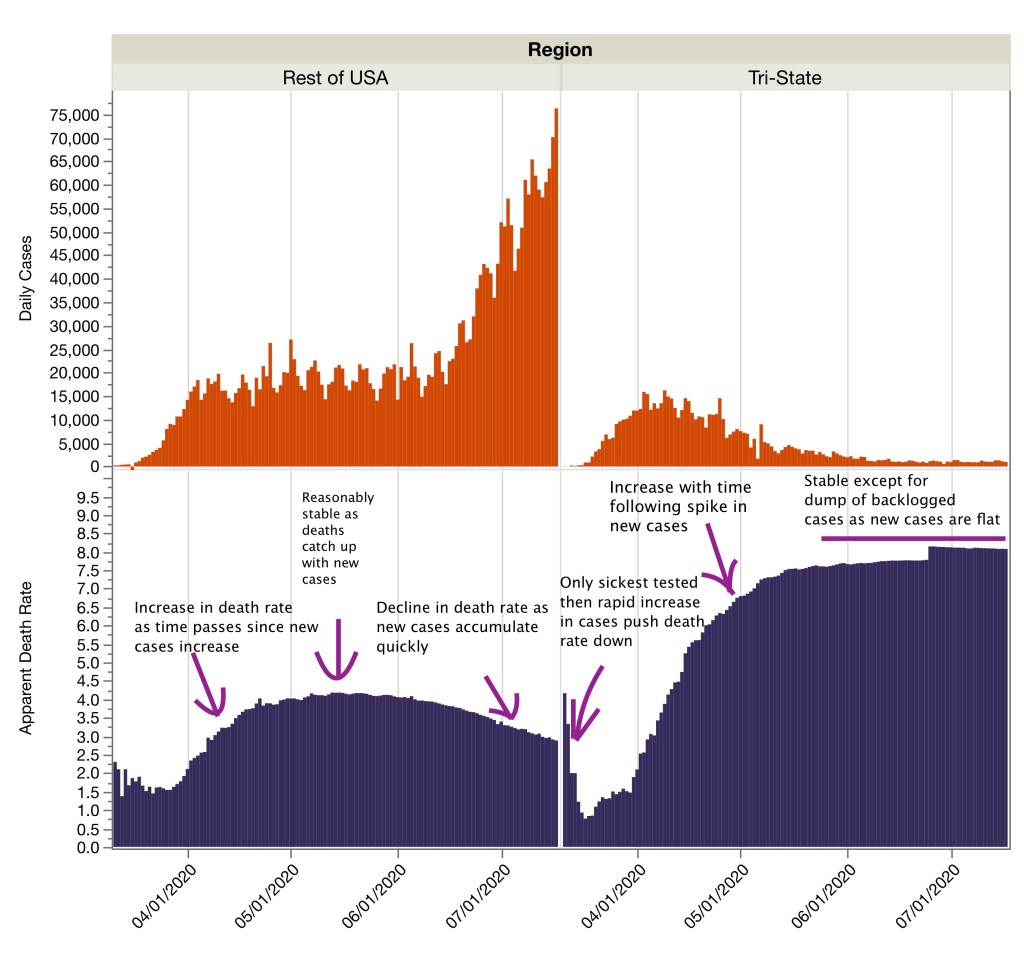
Then, as time goes on and new cases arise quickly the apparent death rate goes down, because the new cases are actually new and it will be an average of 18 days (from the FL data) until the average death and up to 110 days. That means the cases go into the denominator of the death rate (the bottom of the fraction) before we know the actual number of the numerator (deaths; the top of the fraction). We see this for both the Tri-State Area and the rest of the country.
The two patterns diverge over time, with the new cases in the Tri-State area going down and staying low, while in the rest of the US, new cases increase rapidly. At this point we see that the apparent death rate for the Tri-State stays level (the deaths have “caught up” with the cases), except for a big dump of backlogged cases in late June. Notice the death rate does not have a downward trend one the new cases have flattened out and stay low.
For the rest of the USA, the apparent death rate decreases through June and July as the number of new cases continue to push the denominator of the fraction up, which makes the rate go down. This is not because the virus is less lethal, it is just that all the new cases are swamping the signal with thousands and thousands of cases for which we do not yet know the outcome.
This explanation does not account for differences between cases and in different regions that can be attributable to differences in medical care, early detection, age distribution, and other factors that might make the death rate different in different states. These factors may be helping the actual death rate. But we can’t really assess those factors until exponential growth has been stopped and time has passed or the statistics are analyzed on a person by person basis, connecting each new positive case with an eventual outcome. Those data are not available publicly and everyone is trying to make sense of these aggregate data instead.
I won’t link to the right-wing blog that is making a big deal out of low death rates and how good that makes the US look compared with Europe, but suffice to say what they are actually putting forward as evidence of good news is actually the very bad news that our apparent death rate is declining because we are in exponential growth, in addition to missing the fundamental role of age structure in national-level death rates.
